Fall hasn’t even officially made it here yet, but paint companies and the design world are already focused on next year! Several of the largest paint companies have already announced their picks for the 2019 Color of the Year.
Behr Paint has named Blueprint S470-5 the top color for 2019. Blueprint is a mid-tone blue described as “warmer than denim and softer than navy,” and it serves as the focal point for Behr’s annual Color Trends, a palette of 15 supporting colors.
“Much like the sketches builders rely on to bring an architectural design to life, Blueprint S470-5 lays a foundation for consumers to make their unique vision a reality,” says Erika Woelfel, vice president of color and creative services at Behr, in a press release. “This universally appealing hue provides a steady stream of positivity and is poised to be an instant classic for years to come.”

Appropriate on walls, trim, ceilings or used as an accent color, Blueprint pairs perfectly with 2019’s four unique trend palettes – a monochromatic option in various shades of blue; an earth tones palette that incorporates browns and clay tones; the pastel palette, comprised of soft grey, purple and sand; and a jewel tones grouping that features greens, golds and purples.
Sherwin-Williams selected an earthy tone with the moniker Cavern Clay, SW 7701, for 2019. This warm terracotta shade is a “nod to midcentury modern style, but with the soul of the American Southwest.” A perfect complement to the increasingly popular desert modern aesthetic, the bold color thrives in a casual and refined setting.
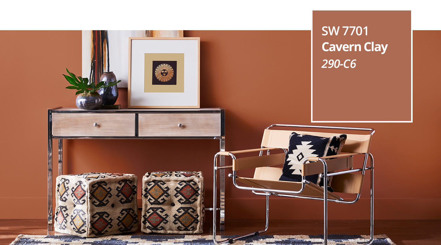
“We believe 2019 will be a renaissance of the 1970s—with a twist. In the coming year, we will embrace our pioneering spirits and artisan ingenuity,” says Sue Wadden, director of color marketing at Sherwin-Williams. “Our 2019 Color of the Year, Cavern Clay, embodies renewal, simplicity and free-spirited, bohemian flair.”
This sun-washed hue works perfectly with complementary materials that include leather, simple woodgrains and indigenous cacti in contemporary, sleek planters. Sherwin-Williams recommends pairing the color with other neutrals, such as warm gray or deep brown. Or, choose to go with a refereshed version of ‘70s earth tones by incorporating the color with a “dusty, denim blue” or a “fresh avocado.”
The 2019 Color of the Year selected by PPG is Night Watch (PPG1145-7), a rich and luxurious yet classic shade of green. Chosen because of its ability to “emulate the feeling of lush greenery and the healing power of nature,” Night Watch is a versatile color that can be used in a variety of applications and design elements.
“The restorative power of nature is important in society now more than ever,” explains Dee Schlotter, PPG senior color marketing manager. “Night Watch is about bringing the healing power from the outdoors into your home through color. The dark green hue pulls our memories of natural environments to the surface to recreate the calming, invigorating euphoria we feel when in nature.”
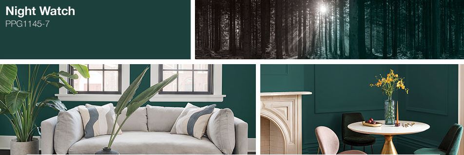
PPG recommends using Night Watch as a focal accent wall, especially in places without any view or tie to the outdoors. It’s also a trendy and gorgeous alternative to the typical black or dark blues used on exteriors. Or, incorporate a touch of the color outside by using it just for doors and shutters.
Last but not least is Pineapple Cream Granita, the 2019 Color of the Year selected by Ace Hardware and Clark+Kensington. Selected entirely by a consumer-led color contest, the color is a light and airy yellow mixed, created and named by an Ace Hardware consumer. The contest took place earlier this year and was designed to inspire and encourage consumers to create colors they would like to see in their own home.
“When I created this color, I was daydreaming about enjoying a delicious dessert while on a relaxing vacation in Sicily with my daughter,” said winner Francine C. “The color is soothing and yet bright; sweet with just a bit of tartness. It was so much fun to participate in this process and I hope everyone loves Pineapple Cream Granita as much as we do!”
The selected Colors of the Year tend to influence design in the coming year, from home design to clothing choices. Stay tuned to see how these colors impact our world in 2019!