2022 Paint Colors of the Year Range from Calming to Invigorating
While 2021 isn’t over yet, renowned paint companies are releasing their 2022 picks for the color of the year. After yet another tumultuous year, many designers and homeowners anticipate the exciting release of colors and pallets to refresh spaces and create new, colorful memories. With a variety of color choices from large paint producers, 2022 is sure to be a year fit for any pallet.
Behr Chooses Breezeway
Behr recently released its official 2022 Color of the Year, Breezeway setting the course for another year of soft, earthy tones for homeowners to build serene spaces, perfect for remote work.
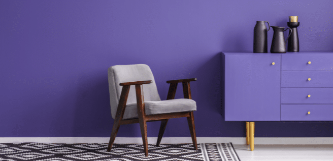
Breezeway, a soothing pale green color, continues the trends for colors that designers selected in 2021 after several years of vibrant color choices. Before the 2020 pandemic, vivid hues were often the color of the year with PANTONE choices like 2017’s Greenery, 2018’s Ultra Violet and 2019’s Living Coral.
The Behr choice offers serenity and freedom for homeowners when designing living spaces. An understated tone allows the use of vibrant furniture pieces and wall art to produce an overall feeling of calm within communal areas. Behr stated the choice offers “an open invitation to experience the world with a fresh perspective, both within the home and beyond the front door.”
Sherwin Williams Selects Evergreen Fog
Sherwin-Williams selects Evergreen Fog SW 9130 as its 2022 Color of the Year. A nourishing and sophisticated gray-green, the soothing, subtle shade is easy to use in every part of the home and suits a variety of spaces, substrates, and design styles, including art deco, modern organic, and postmodernism, reports the company.
Led by director of color marketing Sue Wadden, the Sherwin-Williams color and design team researches and identifies trends that influence the way people interact with color. From those findings, the team turns emerging themes into the annual Colormix Forecast and selects the Color of the Year from the chosen color predictions.
“Evergreen Fog is a sophisticated wash of color for spaces that crave a subtle yet stunning statement shade,” says Wadden. “Evergreen Fog inspires us to begin again and is a great choice for modern interiors and exteriors.”
The color is part of the Method palette in the Sherwin-Williams 2022 Colormix Forecast which include organic neutrals such as Shoji White SW 7042, Accessible Beige SW 7036, and Woven Wicker SW 9104, and tonal luxurious hues such as Urbane Bronze SW 7048, Über Umber SW 9107 and Bakelite Gold SW 6368.
HGTV Home by Sherwin Williams Selects Aleutian
The Sherwin Williams choice is described as a perfectly balanced washed indigo that sets a restful tone. This blueish gray is grounded in both warm and cool tones and is sure to bring relaxation to any room. Aleutian is part of Sherwin Williams Softened Refuge Color Collection composed of soft, simple tones to inspire peacefulness and balance. This collection includes 10 complimentary colors that work well with the color of the year. The palette is influenced by global lifestyle trends including the need to find refuge at home.
PPG Names Olive Sprig
PPG’s choice of Olive Sprig compliments the trend of earthy, subdued tones following its serene 2021 “Be Well” pallet. This elegant green-grey tone is described as relaxing but enticing with the feel of aloe vera or a fragrant plant. Olive Sprig works well both indoors and outdoors and blends well with natural materials.
“As many of us know following a year of lockdown, the easiest way to shift your mindset is to change your environment,” says Amy Donato, senior color marketing manager at PPG paint. “DIYers, property managers, designers, and architects are shifting away from the stark, neutral palettes of yesterday and opting for color in all forms. Call it rebellion, but we are certainly here for the resurgence of optimistic colors to guide us into a new era of home design.”
Pantone Creates ‘Very Peri’ for 2022 Selection
The most anticipated color of the year selection, PANTONE announces Very Peri, is a vibrant blue hue with energetic violet-red undertones. The choice directly contrasts the gentler choices made by other large paint manufacturers.
Executive Director of the Pantone Color Institute Leatrice Eiseman shared, “Very Peri displays a spritely, joyous attitude and dynamic presence that encourages courageous creativity and imaginative expressions.”
A lot of thought goes into the PANTONE color of the year selection. By evaluating color trends and influences found within the entertainment, fashion, art and travel industries, the PANTONE Color Institute narrows down the perfect pick to set the tone for the coming year. For 23 years, the PANTONE Color of the Year selection has influenced purchasing decisions and merchandise production across several industries, from fashion and industrial design to product branding.
PANTONE also released its color selections for New York Fashion Week (NYFW) earlier this year. These Spring/Summer Core Classics offer a mix of vibrant colors and muted tones. According to Pantone Color Institute experts, these colors reflect aspirations for balance in the world. The colors selected reflect our need for comfort, clarity and security. While also giving a nod to free-spirited optimism, and a feeling of new liberation.
Shop limited-edition Very Peri products on the PANTONE website.
Valspar Names 12 Colors for 2022
Valspar unveils 12 shades for its 2022 Colors of the Year that evoke warmth, calmness and comfort. The palette seeks to empower consumers to think positively about the future while creating spaces in their homes that provide solace and a comfortable feeling in the present. Valspar curated these 12 trending hues to include a range of shades that provide flexibility and can be incorporated into existing design elements of the home. Check out the complete palette and descriptions below.
- Blanched Thyme – Calming and nourishing, this natural green shade encourages balance.
- Gilded Linen – Soft and cozy, this minimalist white gives homeowners space to breathe and declutter their minds.
- Delightful Moon – This bright yellow color radiates warmth and takes on sophistication, expanding the natural tones in the home.
- Lilac Lane – A light purple shade with versatility, soothing, and restorative qualities brings a new softness into the home.
- Mountain River – A natural blue hue with depth creates an indulgent escape within the home.
- Orchid Ash – Pure and clean, the simple quality of the shade creates a mindset for a hopeful future.
- Grey Suit – Dependable and reliable, this warm grey works well in any setting, in any home.
- Subtle Peach – A simple peach pastel brings owners back to the basics. Its natural quality gives a lived-in attribute that feels clean and modern.
- Rustic Oak – A warm shade, reminiscent of copper, creates a space for people to feel protected and comforted.
- Sunset Curtains – Homeowners have embraced warm neutrals back into the home for comfort. The familiar hue is reassuring.
- Country Charm – Create a space to relax and unwind with this warm, comforting neutral shade.
- Fired Earth – A classic shade with warm depth, this hue evokes a feeling of stability and comfort.
Benjamin Moore Chooses October Mist
For 2022, Benjamin Moore announced its color of the year to be October Mist. The selection is reminiscent of green pastures, flowers and meadows and is described by the company as a color to “[provide] effortless harmony for any paint project, and every design style.” The company’s choice stays on-trend for the earthy, natural selections chosen by leading paint producers and is sure to bring a refreshing and calm tone to the coming year.
The highly anticipated reveal also included a large palette of 14 complimentary picks including:
- Wild Flower
- Pale Moon
- Steam
- Morning Dew
- Collector’s Item
- Hint of Violet
- Mysterious
- Quiet Moments
- Fernwood Green
- Natural Linen
- Venetian Portico
- High Park
- Gloucester Sage
Each color offers a splendid pairing with the 2022 color of the year to direct designers, homeowners and renovators in exciting and colorful directions. Visit the website to view color combinations, stylish renditions of the color of the year and a unique 360° experience highlighting the exciting selection.
The 2022 season of color is sure to be an interesting one with beautiful, contradicting color choices perfect for customization and individuality.
Thanks for the interesting article. We will use your tips to make a modern interior. in 2022 we plan to renovate our office and think about the color Olive Sprig and make bright accents with Very Peri.
Great color suggestions for 2022. As a house painter, I’m seeing a lot of these trending on house painting requests from clients early this year. Specifically all shades of green, including the really nice hue of evergreen fog.